In short
- Distinguish first use, filtered results, restricted access and missing data.
- Document the trigger, next action and review evidence for each state.
- Verify uncertain saves before offering a retry.
- Test transitions, keyboard use and mobile recovery in the implemented product.
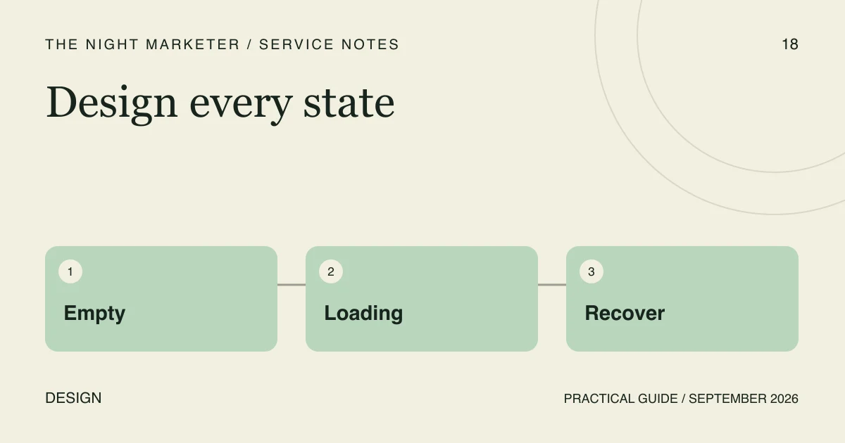
Dashboard empty, loading and error states determine whether people can finish a task when the ideal screen is unavailable. In an illustrative first-day rollout, there are no records, a report is still loading and one colleague lacks permission. A polished chart does not explain any of those situations. Specify the state and the next useful action alongside the main screen.
Separate first use, filtered results and restricted access
No records yet, no matches for a filter and no permission to view records need different explanations. First use may need onboarding or an authorised create action. An empty filter needs a reset. A restricted view should explain the route to assistance without confirming private record contents.
Do not show invented numbers as if they were live activity. Label demonstration data clearly, and keep it out of actual reporting. For a displayed zero, distinguish a confirmed zero from unavailable or not-yet-loaded data.
Define each state in a handover table
A state specification should tell the designer, developer and reviewer what evidence activates a view and what the user can do next. These examples are illustrative acceptance criteria, not measured client outcomes.
| State | Evidence and user action | Review check |
|---|---|---|
| First use | The authorised query completed with no records; offer the relevant first step | A permitted user can start without sample data looking real |
| Filtered empty | The query completed with no matching rows; retain the active filters and offer reset | Reset removes the restriction without implying that records were deleted |
| Loading | The request is pending; reserve space and show progress | Controls stay in place and repeated clicks have defined behaviour |
| Restricted | Access is denied; explain the help route without private content | The interface does not expose hidden rows or restricted totals |
| Failed or uncertain save | The result is failed or unconfirmed; preserve safe input and explain the next check | Retry does not silently create duplicate records |
Keep loading from becoming a permanent state
Reserve space so controls do not move under a pointer while content arrives. Keep navigation or cancellation available where practical. Agree when a long-running request should show a different explanation, and distinguish “still running” from “failed”. A spinner without a recovery path leaves the user guessing.
Decide what happens to repeated clicks: prevent duplicate submission, show the pending action or use another appropriate control. The design needs to match the application's actual behaviour rather than promise cancellation that the system cannot perform.
Explain errors and uncertain outcomes accurately
Use plain language about the task and the next action. Do not expose internal stack traces. A timeout after saving is not proof that nothing changed: confirm the record state before encouraging another submission. Preserve safe input where appropriate, with special care for shared devices and sensitive fields.
W3C's form notification guidance explains ways to communicate errors and successful completion. Include perceivable status feedback and useful error descriptions in the design, then test the implemented experience with keyboard and assistive-technology use. A visual mock-up alone does not establish accessibility.
Test the transitions, not just isolated screenshots
Review loading to empty, loading to success, failure to retry and permission changes using representative test accounts and controlled sample data. Check focus after an error and after a successful action. On mobile, make sure the message and recovery control remain readable without hiding the task.
For an illustrative task list filtered to a month with no records, retain the month and offer a clear reset. Do not replace that state with “Create your first task”, which implies that the whole organisation has no tasks.
Bring a real workflow to the design review
Bring the affected screen, user roles, available states and a redacted example of a failed or confusing task. The Night Marketer's UI design services can help define a reusable state specification and developer handover. The goal is a clear task and recovery path in the working product, with review evidence for each state.
Frequently asked questions
Only show zero when the relevant query has completed and confirmed that value. Use a distinct loading, unavailable or error state when the system has not established the result.
A timeout can leave the outcome uncertain. Check the destination state before offering a retry, preserve appropriate input, and explain what is known rather than promising that nothing changed.
Provide each state trigger, permitted action, permission boundary, focus and status behaviour, and acceptance evidence. Include transitions between states so reviewers can test the whole task.