$56M+ Revenue Generated for Clients 450+ Happy Clients 30+ Team Members AI Powered Services $56M+ Revenue Generated for Clients 450+ Happy Clients 30+ Team Members AI Powered Services $56M+ Revenue Generated for Clients 450+ Happy Clients 30+ Team Members AI Powered Services
Back

Landing Page Teardown: What Makes a High-Converting Product Page

Landing Page Teardown: What Makes a High-Converting Product Page

Table of Contents

    In the world of e-commerce, your product page is your best salesperson. You can drive all the traffic in the world, but if your product page doesn’t convert, nothing else matters.
    At The Night Marketer, we work with D2C brands, subscription businesses, and scaling e-commerce stores - and we’ve seen one thing consistently: small improvements on a product page can increase conversions by 2× or even 3×.
    In this teardown, we break down the key elements that make a high-converting product page, common mistakes brands make, and actionable fixes you can apply today.


    Why Product Page Optimization Matters

    • 53% of users leave a page if it takes more than 3 seconds to load.
    • Adding social proof can increase conversions by up to 35%.
    • Clear CTAs improve checkout rate by 26%.
    • High-quality visuals increase purchase confidence significantly.

    Your product page needs to do three things quickly:
      Build trust
      Reduce hesitation
      Show value clearly


    Teardown Framework Used at The Night Marketer

    Every product page we optimize is reviewed across these pillars:

    1. First Impression & Above the Fold

    The user decides within 3-5 seconds whether to scroll or bounce.

    Winning elements include:

    • Clear product name and purpose
    • High-quality image/video focused on use case
    • Visible price and offer
    • Strong CTA (Buy Now / Add to Cart)
    • Short trust bar (shipping, guarantee, reviews, secure checkout)

    Common mistake: Long intro text and weak CTAs below the fold
    Quick fix: Move your CTA and key benefits into the first screen view


    2. Visual Storytelling & Media

    People buy what they can visualize themselves using.

    Best practices:

    • Multiple angles of product images
    • UGC lifestyle photography
    • Short demo video (even 10–15 seconds boosts time on page)
    • Zoomable images & 360° option

    Pro tip: Add a video review under Add to Cart — it increases conversion for hesitant buyers.


    3. Persuasive & Benefit-Driven Copy

    Copy should sell outcomes, not features.

    Weak Copy

    Strong Copy

    Includes 500mAh battery

    Use all day without charging — 12-hour power guaranteed

    Organic ingredients

    Safe for sensitive skin — zero irritation results in 7 days.

    Framework: Problem → Promise → Proof → CTA


    4. Social Proof & Trust

    People believe people — not brands.

    Elements that improve trust:

    • Reviews with photos
    • Rating score displayed near CTA
    • Before/after results
    • Influencer testimonials
    • Guarantee statement

    Try: 30-Day Risk-Free Trial — Full Refund if You’re Not Happy


    5. Pricing, Offers & Urgency

    Simple pricing + clarity = confidence.

    What converts best:

    • Tiered pricing or bundle discounts
    • Free shipping threshold
    • Limited-time offers
    • Progress bars/stock counters (ethical)

    6. Page Speed & Mobile Experience

    70%+ of e-commerce traffic is mobile.

    Checklist:

    • Compressed product images
    • Lazy loading
    • Minimal pop-ups on mobile
    • Sticky add-to-cart button

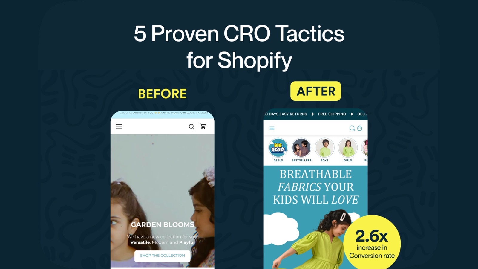
    Real Example: Product Page Fixes That Increased Conversions by 2.1×

    (Anonymous client — fashion e-commerce)

    Before

    After

    CTA below the fold

    CTA placed above the fold

    No product video

    Added 20-second try-on video

    Weak social proof

    Added 500+ photo reviews + UGC section

    Slow speed (6.2s load)

    Reduced load time to 2.3s

    Result

    +74% ATC Clicks
    +112% Conversion Rate Increase
    +28% Average Order Value


    Free Product Page Optimization Checklist

    Use this as your quick audit:

    • Clear headline + value proposition
    • High-quality visuals + video
    • Strong CTA is visible without scrolling
    • Clear pricing & buying options
    • Reviews + UGC + guarantee
    • Benefits > features
    • Fast load speed (<2.5 seconds)
    • Mobile optimized & sticky CTA

    Final Thoughts

    A converting product page isn’t about design trends — it’s about understanding human behavior. The brands winning in 2025 are the ones that simplify decisions, build trust fast, and communicate value clearly.
    If you’d like us to teardown your product page and suggest improvements based on real conversion data:

    Get a Free Landing Page Audit

    Book a 20-minute strategy call, and we’ll send a full teardown video with practical fixes.

    Tags
    CRO landing page optimization product page teardown ecommerce design Shopify optimization D2C marketing UX/UI ecommerce conversion tips marketing strategy ecommerce growth

    Author avatar
    Written by:
    Team TNM

    The Night Marketer (TNM) is a results-driven digital marketing agency specializing in e-commerce, SEO, and brand strategy.

    Published Date: 28 Nov 25

    - BOOK YOUR CALL - LET'S DISCUSS YOUR IDEA
    owl